
In this post I am going to discuss a Matplotlib feature which let you add multiple plots within a figure called subplots.
Subplots are helpful when you want to show different data presentation in a single view, for instance Dashboards.
There are multiple ways you can create subplots but I am here going to discuss the one which let you add graphs in grids by using subplot2grid method. subplot2grid takes two mandatory parameters, the first one is size and the next is location. A typical subplot2grid call will look like below:
ax = plt.subplot2grid((2, 2), (0, 0))
The first parameter is the size that is a 2 x 2 grid, the 2nd is the location or quadrant where the graph will be plotted. The illustration will help you to understand it further.
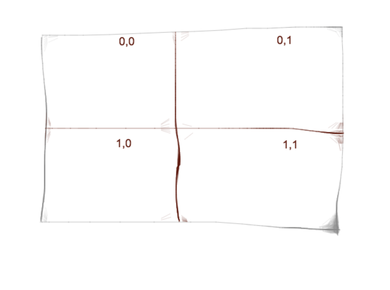
So first graph in 0,0, 2nd in 0,1 and so on..
Now let’s get into code. The data I am going to use is the Crypto Trading Data of my favorite coins on Bittrex Exchange. We will fetch data latest 5-min interval data from bittrex for Ethereum, Stratis, Ark and TenX coins and display as subplots within a figure.
import json
import time

import matplotlib.pyplot as plt
import pandas as pd

if __name__ == '__main__':
    # ETH
    data_eth_btc = get_data('BTC-ETH', 'fivemin')
    last_few = data_eth_btc.tail(50)
    close_eth = last_few['Close']
    last_few['Time'] = pd.to_datetime(last_few['T'])
    del last_few['T']

    # STRAT
    data_strat_btc = get_data('BTC-STRAT', 'fivemin')
    last_few_strat = data_strat_btc.tail(50)
    close_strat = last_few_strat['Close']
    last_few_strat['Time'] = pd.to_datetime(last_few_strat['T'])
    del last_few_strat['T']

    # ARK
    data_ark_btc = get_data('BTC-ARK', 'fivemin')
    last_few_ark = data_ark_btc.tail(50)
    close_ark = last_few_ark['Close']
    last_few_ark['Time'] = pd.to_datetime(last_few_ark['T'])
    del last_few_ark['T']

    # PAY
    data_pay_btc = get_data('BTC-PAY', 'fivemin')
    last_few_pay = data_pay_btc.tail(50)
    close_pay = last_few_pay['Close']
    last_few_pay['Time'] = pd.to_datetime(last_few_pay['T'])
    del last_few_pay['T']
I am using a custom get_data() function which takes interval and crypto pair and returns data in Pandas dataframe format. Since the objective is not to teach how data being fetched so I am not giving get_data() code for sake of simplicity.
OK data is fetched in dataframe and I am picking last 50 entries thus using tail() here. In order to show time data we need to use pd.to_datetime to convert in internal datetime format and delete the original time data provided by the API by calling del function.
Our required data is available and now we have to plot 4 graphs for different coins.
    ax = plt.subplot2grid((2, 2), (0, 0))
    ax.plot(last_few['Time'], close_eth)
    plt.title('BTC-ETH')

    ax1 = plt.subplot2grid((2, 2), (0, 1))
    ax1.plot(last_few['Time'], close_strat)
    plt.title('BTC-STRAT')

    ax2 = plt.subplot2grid((2, 2), (1, 0))
    ax2.plot(last_few_ark['Time'], close_ark)
    plt.title('BTC-ARK')

    ax3 = plt.subplot2grid((2, 2), (1, 1))
    ax3.plot(last_few_pay['Time'], close_pay)
    plt.title('BTC-PAY')

    plt.show()
First, the grid was set and location is set and assigned to ax variable and then the graph was plotted. Once all 4 graphs plotted they were then displayed by calling show() once and something like below appears:
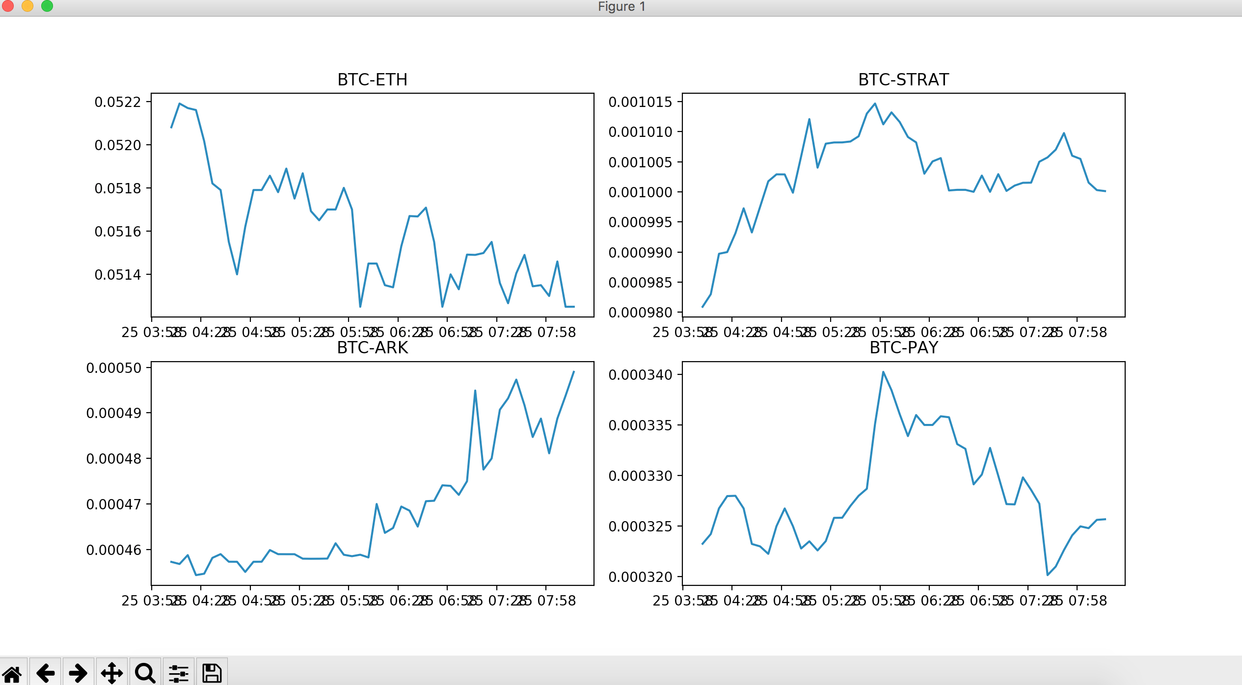
The graphs were plotted as of Dec, 25,2017 around 1PM(GMT+5) and you can see only ARK is on uptrend.
Alright and this sums up the Python Graph series in matplotlib. I might cover the candlestick graph but can’t commit so consider this series done here. As always, do give your feedback in comments below.