This post is part of the T4p Series.
In this post, we will briefly discuss candlesticks, their basics, types, and how you can use OHLC data to identify them. I’ll aim to keep it short and to the point.
What is a CandleStick
Candlesticks are graphical representations of price movements in financial markets, typically showing the opening, closing, high, and low prices for a specific time period.
History of CandleSticks
Candlestick charting has a rich history that dates back centuries. It originated in Japan during the 18th century, long before the advent of modern financial markets as we know them today.
The story begins with Munehisa Homma, a Japanese rice trader from Sakata. In the 1700s, he began recording price movements in the rice markets, developing a method that eventually evolved into candlestick charting. Homma traded in the Dojima Rice Exchange in Osaka, which was essentially the world’s first futures market.
Homma’s techniques were so successful that he reportedly made a fortune equivalent to billions in today’s currency. He wrote several books on the subject, including The Fountain of Gold – The Three Monkey Record of Money.
Anatomy of a Candlestick
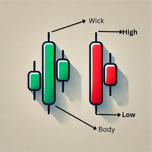
A candlestick consists of two parts:
- Body: This is the chunky middle part. It shows you the opening and closing prices. A tall body means there was a big price move that day – lots of action! A short body? Things were pretty calm.
- Wick: The thin lines extending above and below the body are known as wicks or shadows. The upper wick shows the highest price reached during the time period while the lower wick shows the lowest price during the time period. The length of the wicks tells you how volatile the price movement was. Long wicks suggest a lot of price fluctuation, while short or no wicks indicate that prices remained more stable around the open and close.
The length of the wicks tells you how volatile the price movement was. Long wicks suggest a lot of price fluctuation, while short or no wicks indicate that prices remained more stable around the open and close.
CandleSticks Types
In a broad sense there are two only two types of candles:
- Bullish Candle: A candlestick where the closing price is higher than the opening price, indicating that buyers pushed the price up. They are usually green in color.
- Bearish Candle: A candlestick where the closing price is lower than the opening price, showing that sellers drove the price down. They are usually red in color.
These candles are created on a two-dimension chart.
Identification of Bullish and Bearish Candle
Now the programmer in you can’t control anymore and you want to know how programmatically you can identify a candlestick, as mentioned candlestick is displayed on a chart hence, let’s create a chart first. I am going to use mplfinance library that is provided by matplotlib library to create financial charts. Install it first:
pip install --upgrade mplfinance
Below is the code to generate it:
import mplfinance as mpf
import pandas as pd

def plot_candlestick_from_dict(data):
    df = pd.DataFrame(data)
    df['Date'] = pd.to_datetime(df['Date'])
    df.set_index('Date', inplace=True)
    mpf.plot(df, type='candle', style='charles', title='Candlestick Chart', ylabel='Price')

ohlc_data = [
    {"Date":"2024-09-01", "Open":100, "High":106, "Low":95, "Close":102},
]

plot_candlestick_from_dict(ohlc_data)
Here I am passing a single entry or I say, the data of a single candlestick to plot it on the chart, on the notebook it is displayed below:
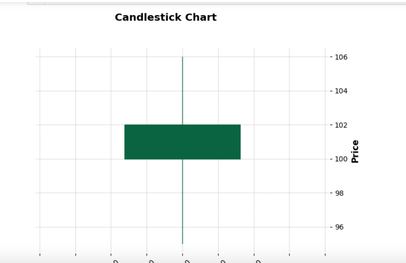
The candle is bullish because the closing price is greater than the opening price hence green.
Now, how’d you interpret the above candle? pretty simple! assuming this candle is for an hour. This candle tells about a tough fight between buyers and sellers. Buyers were dominant but sellers were not giving up either, at some point during the course they had almost beaten buyers(the lower wick that touches 96) but buyers got up and fought back, in the end, buyers were winners.
Now, let’s generate a bearish candle, I am passing this data: {"Date":"2024-09-01", "Open":100, "High":101, "Low":93, "Close":95}
and it generates a candle like this:
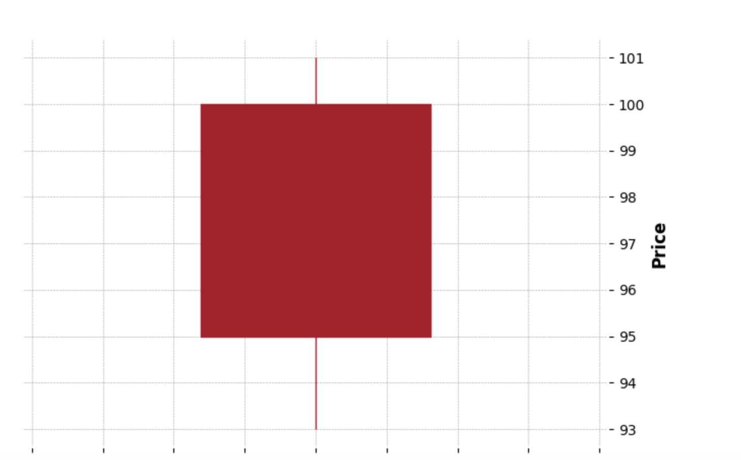
What does this candle tell? This candle shows that sellers were dominant during the course, they tried hard to dump their shares and at some point, knocked out buyers(touches 93). The buyers did show some courage but in the end, it was the sellers who won this battle.
Alright, so that was the visual part. What if you want to know whether there is a bullish candle or not. Here is a simple function about it:
def is_bullish_bearish(candle_data):
    result = []

    for candle in candle_data:
        open_price = candle['Open']
        close_price = candle['Close']

        if close_price > open_price:
            candle_type = 'Bullish'
        elif close_price < open_price:
            candle_type = 'Bearish'
        else:
            candle_type = 'Neutral'

        result.append({"Date": candle["Date"], "Candle": candle_type})

    return result
When you run it it returns the following:
[{'Date': '2024-09-01', 'Candle': 'Neutral'}, {'Date': '2024-09-02', 'Candle': 'Bullish'}, {'Date': '2024-09-03', 'Candle': 'Bearish'}]
Conclusion
In this post, we covered the basics of candlesticks and how to draw and detect them in Python. In the next post, I’ll discuss candlestick patterns—there are many to explore in the upcoming posts.