
In last post I talked about plotting histograms, in this post we are going to learn how to use scatter plots with data and why it could be useful.
What is Scatter Plot?
From Wikipedia:
A scatter plot (also called a scatterplot, scatter graph, scatter chart, scattergram, or scatter diagram)[3] is a type of plot or mathematical diagram using Cartesian coordinates to display values for typically two variables for a set of data. If the points are color-coded, one additional variable can be displayed. The data are displayed as a collection of points, each having the value of one variable determining the position on the horizontal axis and the value of the other variable determining the position on the vertical axis.[4]
Scatter Plots are usually used to represent the correlation between two or more variables. It also helps it identify Outliers, if any.
Enough talk and let’s code. First come up with an arbitrary but interesting example. Suppose the result was announced for a class. In this class both guys and girls appeared in the exam. The goal is to find out who performed better and how to get rid of shortcomings. We are going to make a scatter plot for that.
import matplotlib.pyplot as plt
import pandas as pd

girls_grades = [89, 90, 70, 89, 100, 80, 90, 100, 80, 34]
boys_grades = [30, 29, 49, 48, 100, 48, 38, 45, 20, 30]
grades_range = [10, 20, 30, 40, 50, 60, 70, 80, 90, 100]
plt.scatter(grades_range, girls_grades, color='r')
plt.scatter(grades_range, boys_grades, color='g')
plt.xlabel('Grades Range')
plt.ylabel('Grades Scored')
plt.show()
We have grades available in two different lists and we are going to call scatter twice to plot different data sets. When it runs it produces a graph like below:
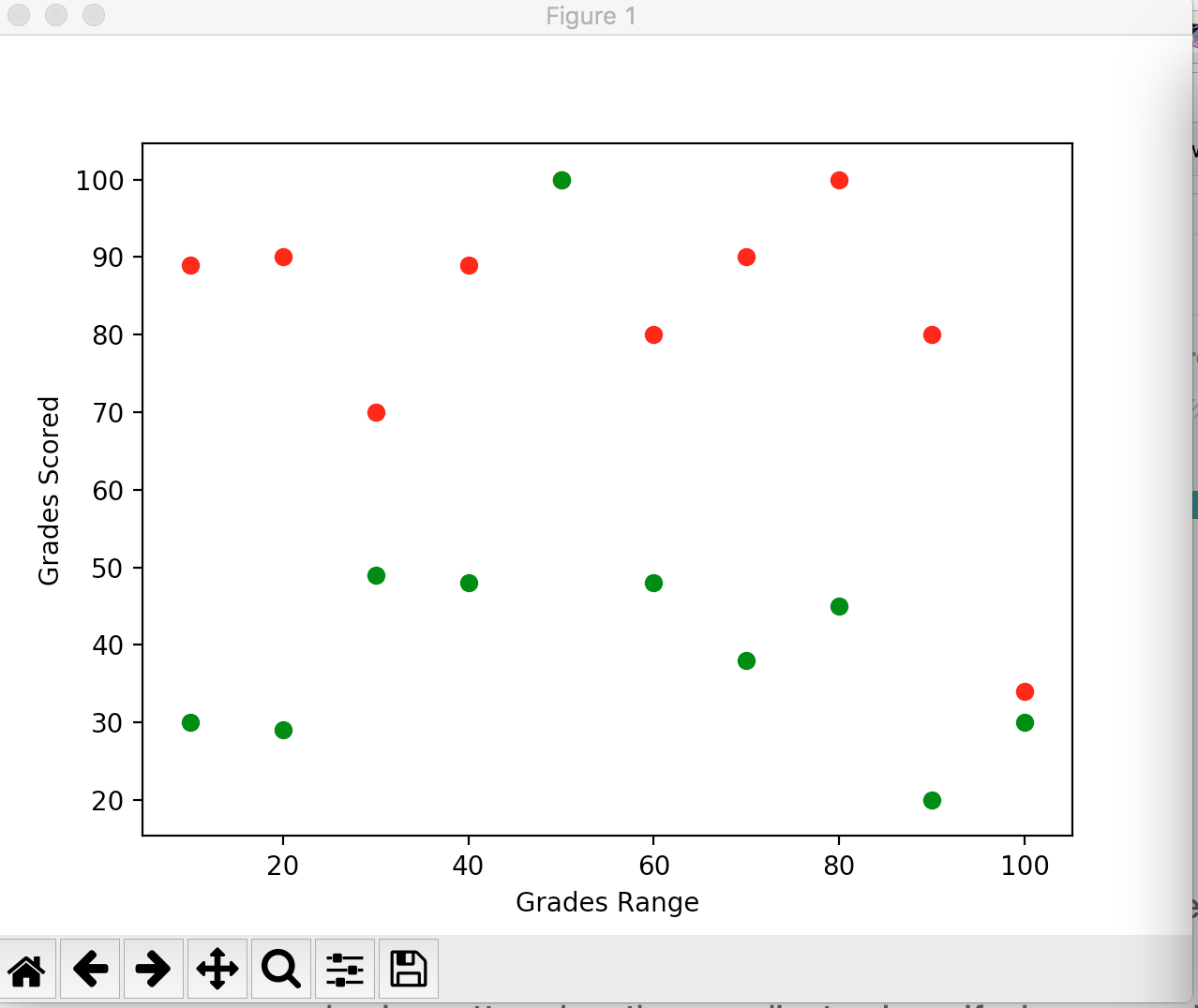
Boys are in green while girls in red. The graph is clearly telling that girls performed way better than guys but.. it also tells another interesting story. There are two outliers, one in guys and other in girls. The guy performed pretty well while a single girl did pretty bad. Data tells you story, it helps you to investigate unknowns. Graphs help you to find the fact and then investigate the causes this result got produced. Imagine if a school head hire a statistician, he would present this graph and then will ask the head to call these two buddies for their exceptional results. There are chances that the guy who performed well was being strictly monitored by parents and he was asked to work well or guided well. The girl did not perform well could have some domestic issue, or ill.. whatever. The point is data helps you to find facts.
Alright so after this fake data let’s deal with real data. We have to find sea level rise in past 100 years. I grabbed the data from here.
d = pd.read_csv('sealevel.csv')
year = d['YEAR']
sea_levels = d['CSIRO_SEALEVEL_INCHES']
plt.scatter(year, sea_levels, edgecolors='r')
plt.xlabel('Year')
plt.ylabel('Sea Level (inches)')
plt.title('Rise in Sealevel')
plt.show()
The graph it produced:
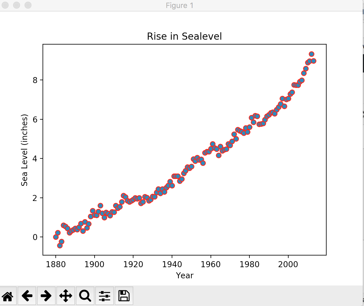
O boy! the situation is not well, climate change or whatever the reason is, it’s increasing sea level almost every year. There are no clear outlier here, at least in this graph. There might be a few if we zoom in.
Anyways, so that’s it for now.