
Recently I finished up Python Graph series by using Matplotlib to represent data in different types of charts. In this post I am giving a brief intro of Exploratory data analysis(EDA) in Python with help of pandas and matplotlib.
What is Exploratory data analysis?
According to Wikipedia:
In statistics, exploratory data analysis (EDA) is an approach to analyzing data sets to summarize their main characteristics, often with visual methods. A statistical model can be used or not, but primarily EDA is for seeing what the data can tell us beyond the formal modeling or hypothesis testing task.
You can say that EDA is statisticians way of story telling where you explore data, find patterns and tells insights. Often you have some questions in hand you try to validate those questions by performing EDA.
EDA in Python
Multiple libraries are available to perform basic EDA but I am going to use pandas and matplotlib for this post. Pandas for data manipulation and matplotlib, well, for plotting graphs. Jupyter Nootbooks to write code and other findings. Jupyter notebooks is kind of diary for data analysis and scientists, a web based platform where you can mix Python, html and Markdown to explain your data insights.
OK enough talk, it’s time to explore the data and find about it. The data I am using belongs to a fictitious super store. We are going to find answers of a few questions like what are best days in terms of sales, what hours are most suitable so that staff can be placed accordingly.
If you don’t have jupyter installed, install it by running the command pip install jupyter
If you are using Anaconda version of Python then Jupyter and Pandas will already be there. I will highly recommend to use it as it’s specially packaged for people who are into data analysis or Data Science.
Launch Jupyter Note book by running command jupyter-notebook, it will open an interface in your default browser. Create a new notebook and name it, you will see something like below:

You can add text in Markdown format in a cell and in next cell you could start writing code. Jupyter notebooks have *.pynb extension. This is not Jupyter 101 post, you may find many available on Internet, still I will try to explain as much as I can.
In first cell I just added a heading about what I am going to do. You can add anything here, even your selfie but it’s good to put things up which helps the notebook reader what you are talking about.
OK first we need to acquire data. Data is available in CSV format. After necessary imports I am going to call read_csv method of pandas to read CSV file.
import pandas as pd
import numpy as np
import matplotlib.pyplot as plt
%matplotlib inline
If you notice I added %matplotlib inline. What it does that it renders plot inline on your page. You will shortly see how it happens. Next up, read CSV and data cleaning where necessary.
df = pd.read_csv('data.csv')
df['Amount'] = df['Amount'].str.replace('$','').str.replace(',','')
df['Amount'] = pd.to_numeric(df['Amount'])
First I removed the $ sign and then converted the string field into numeric, once done, we should have data in float since we are going to perform mathematical operations on this field. By running the cell by hitting Shift+Enter something like this will appear:

One thing more, I see BranchName field unnecessary since we only have data of a single store so let’s remove it!
df.drop('BranchName',axis=1, inplace=True)
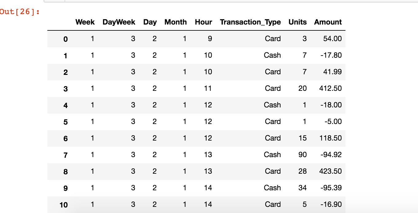
df
It will remove the column, inpace=True makes it to remove in existing DataFrame without re-assigning it. Run again and it shows data like below:
OK operation cleanup is, let’s dive into the data and find insights!
The very first thing we are going to do is to find out number of records and number of features or columns. For that I am going to execute df.shape. When I did this I found the following:
(4100,9)
What does it mean? well it’s actually rows x columns. So here there are 4100 total records and 9 columns, as you can count number of columns above as well.
Alright I did get the idea of total records and columns but um.. I need a detailed summary of this data, for that I am going to run df.describe() and when I do it outputs:
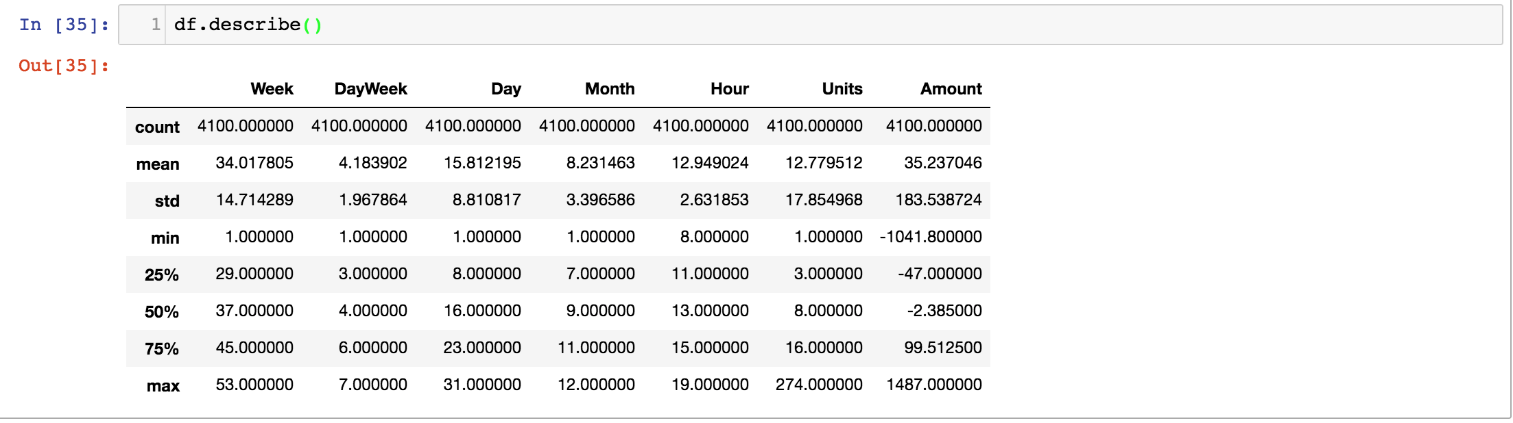
OK some interesting information given here. If you see count it tells the same record count that is 4100 here. You can see all columns have same count which means there are no missing fields there. You can also check an individual column count, say, for Units, all I have to do is:
df['Units'].count()
You are getting a picture of how data is available, what is mean, min and max along with standard deviation and median. The percentiles are also there. Standard Deviation is quite useful tool to figure out how the data is spread above or below the mean. The higher the value, the less is reliable or vice versa. For instance std of Amount is 183.5 while mean is around 35. On other hand mean of Units is 12.7 and std is 17.85. Oh, just to clarify that std is short form of Standard Deviation, NOT Sexual Transmitted Disease, just thought to clarify lest you not think that the our data caught some disease.
Let’s see the distribution of Amount
num_bins = 10
plt.hist(df['Amount'], num_bins, normed=1, facecolor='blue', alpha=0.5)
plt.show()
And it outputs:
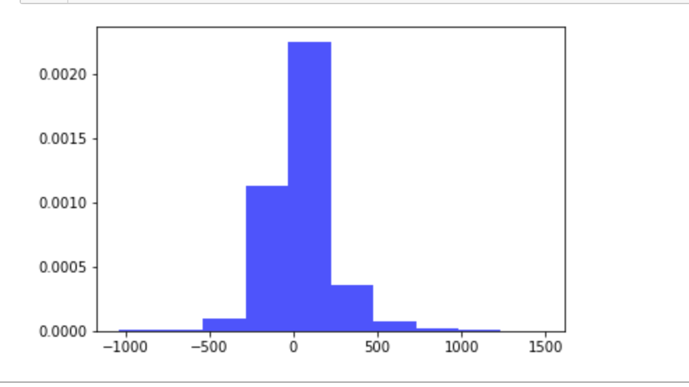
OK ignore this giant..spike for a while and notice the base line which is very large, varies from -1000 to 1000+
Let’s find out Sales by Month, Day and Hour.
Sale by Month
sales_by_month = df.groupby('Month').size()
print(sales_by_month)
#Plotting the Graph
plot_by_month = sales_by_month.plot(title='Monthly Sales',xticks=(1,2,3,4,5,6,7,8,9,10,11,12))
plot_by_month.set_xlabel('Months')
plot_by_month.set_ylabel('Total Sales')
you can use .size() to get aggregated value of the particular column only or .count() for every column. Since we only need for Month so I used that. Plot the graph and you find this:

Life was beautiful till July but then something happened and there was a sharp decline in August, then staff tried hard for next 3 months and then things died again.
Let’s see by Day
Sale by Day
# By Day
sales_by_day = df.groupby('Day').size()
plot_by_day = sales_by_day.plot(title='Daily Sales',xticks=(range(1,31)),rot=55)
plot_by_day.set_xlabel('Day')
plot_by_day.set_ylabel('Total Sales')
The output is:
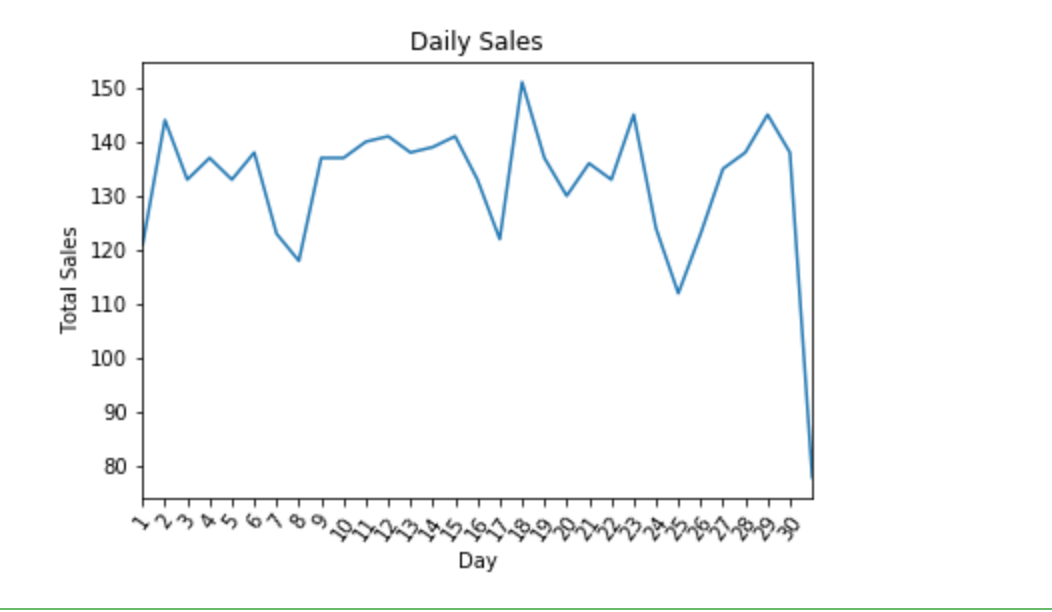
Sales dropped massively at the end of the month otherwise there were constant hickups, 18th day is quite good.
Sale by Hour
sales_by_hour = df.groupby('Hour').size()
plot_by_hour = sales_by_hour.plot(title='Hourly Sales',xticks=(range(5,22)))
plot_by_hour.set_xlabel('Working Hours')
plot_by_hour.set_ylabel('Total Sales')
And it outputs:
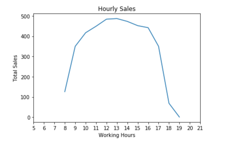
OK seems more customers visit in after noon than closing and opening hours.
Conclusion
That’s it for now. I could go on and on and can find more insights but this should be enough to give you idea how you can harness the power of EDA to find insights from the data. In this data there is a field Transaction Type, your task is to find out no of sales of each transaction type. Let me know how it goes.
As always, the code of this post is available on Github.


One Comment
Rick
“Oh, just to clarify that std is short form of Standard Deviation, NOT Sexual Transmitted Disease, just thought to clarify lest you not think that the our data caught some disease.”
Uhhhh