This post is part of the T4p Series.
In the previous post, we discussed creating your custom signal generation pattern. In this post, we will discuss a famous candlestick pattern called the Hammer pattern. We will discuss the pattern, what it is all about, and how it helps traders to earn money.
Introduction
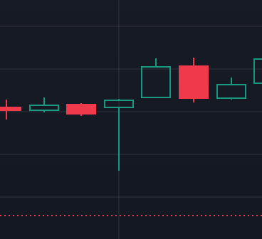
A Hammer is a single candlestick pattern that forms during a downtrend and is characterized by having a small real body at the top of the candle, a long lower shadow (at least 2-3 times the size of the body), and little to no upper shadow. The pattern indicates a potential trend reversal as it shows that despite strong selling pressure (long lower shadow), buyers ultimately regained control by pushing prices back up (small body at the top). As you can see in the image below, it is the 4th one from the left in green.
Types of Hammer Candlestick
There are three two types of hammer patterns:
- Regular Hammer (appears after a downtrend).
- Inverted Hammer (appears after an uptrend).
Usage
Below are the usages of the hammer pattern:
- Trend Reversal Signal: Indication about the potential reversal from downtrend to uptrend(bullish) or vice versa.
- Support and Resistance: Highlights key support levels in downtrends and resistance in uptrends.
- Confirmation: Best used with other indicators for confirming trend reversals.
Spotting The Hammer Pattern
- The close price is near the high of the candle.
- The lower shadow is at least twice as long as the body.
- The upper shadow is minimal or absent.
Development
Visualization
Like before, the first thing we will do is write code for visualizing the pattern itself. Assuming all the required libraries are installed (discussed multiple times in previous posts), I’m going to use ChatGPT to generate fictitious OHLC data tailored to my requirements.
def candle_hammer(df):
    # Fill NaN values with 0
    df = df.fillna(0)

    return (
        ((df["High"] - df["Low"]) > 3 * (df["Open"] - df["Close"]))
        & (((df["Close"] - df["Low"]) / (0.001 + df["High"] - df["Low"])) > 0.6)
        & (((df["Open"] - df["Low"]) / (0.001 + df["High"] - df["Low"])) > 0.6)
    )
data = {
    'Date': pd.date_range('2024-12-01', periods=10, freq='D'),
    'Open': [100, 105, 110, 115, 108, 112, 116, 118, 122, 125],
    'High': [105, 110, 115, 118, 113, 116, 119, 121, 124, 128],
    'Low': [98, 103, 107, 112, 106, 110, 113, 116, 119, 120],
    'Close': [103, 107, 109, 115, 110, 114, 118, 119, 123, 126]
}

# # Adjust the values of the 3rd candle (index 2) to create a Bullish Hammer pattern
# Modify the data to make only the 3rd candle (index 2) a Bullish Hammer
data['Open'][2] = 108     # Small body for Bullish Hammer
data['Close'][2] = 109    # Small body for Bullish Hammer
data['Low'][2] = 100      # Long lower shadow
data['High'][2] = 110     # Small upper shadow

# Modify the other candles to have larger bodies
data['Open'][3] = 115     # Bullish candle with higher close
data['Close'][3] = 120    # Higher close than open
data['Low'][3] = 110      # Normal low
data['High'][3] = 125     # Normal high

data['Open'][4] = 120     # Bearish candle with lower close
data['Close'][4] = 118    # Lower close than open
data['Low'][4] = 115      # Normal low
data['High'][4] = 125     # Normal high

data['Open'][5] = 125     # Bearish candle with lower close
data['Close'][5] = 121    # Lower close than open
data['Low'][5] = 120      # Normal low
data['High'][5] = 130     # Normal high

data['Open'][6] = 130     # Bullish candle with higher close
data['Close'][6] = 134    # Higher close than open
data['Low'][6] = 125      # Normal low
data['High'][6] = 135     # Normal high

data['Open'][7] = 135     # Bullish candle with higher close
data['Close'][7] = 137    # Higher close than open
data['Low'][7] = 130      # Normal low
data['High'][7] = 140     # Normal high

data['Open'][8] = 140     # Bullish candle with higher close
data['Close'][8] = 141    # Higher close than open
data['Low'][8] = 135      # Normal low
data['High'][8] = 145     # Normal high

data['Open'][9] = 145     # Bullish candle with higher close
data['Close'][9] = 146    # Higher close than open
data['Low'][9] = 140      # Normal low
data['High'][9] = 150     # Normal high

# Convert to DataFrame
df = pd.DataFrame(data)
df.set_index('Date', inplace=True)
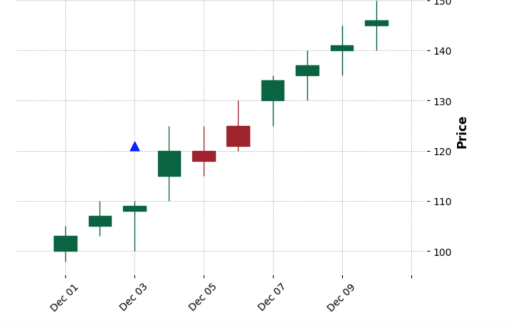
When I run the above code in the notebook, it generates the following chart:
I borrowed the candle_hammer function from here, which was actually an elegant implementation. Then, I asked GPT to generate fake OHLC data that includes a hammer candle as well. In the chart above, you can see an up-arrow indicating the hammer candle.
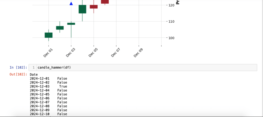
As you see, it generated a hammer candle on December 3rd, having an up-arrow on top of it. Now, what if we run candle_hammer function?
As you can see, it returned True on December 3rd. Sweet!
Now, let’s try these functions on actual data. I am using the Yahoo Finance library to pull daily data for TSLA.
tesla_data = yf.download('TSLA', start='2024-01-01', end='2024-12-31', progress=False)
tesla_data = tesla_data.tail(30) # Last 30 Entries only
visualize_hammer(tesla_data,"TSLA Daily Data")
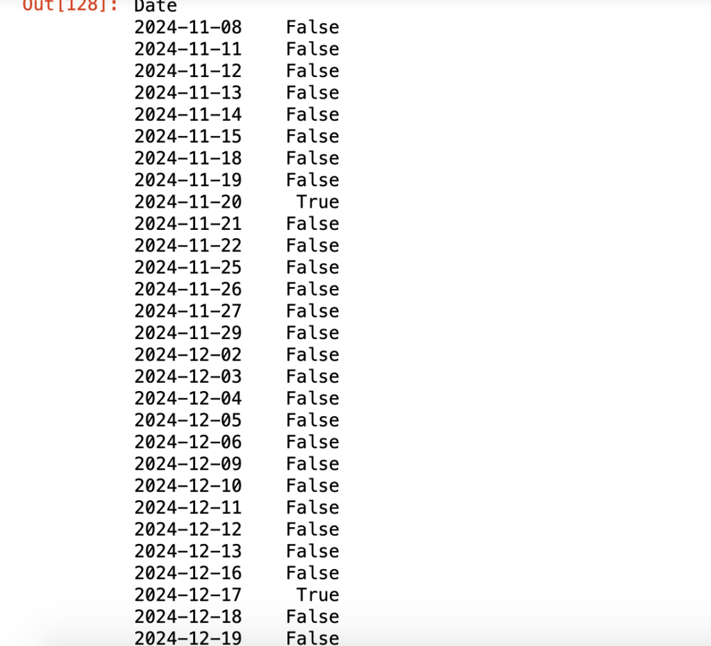
candle_hammer(tesla_data)
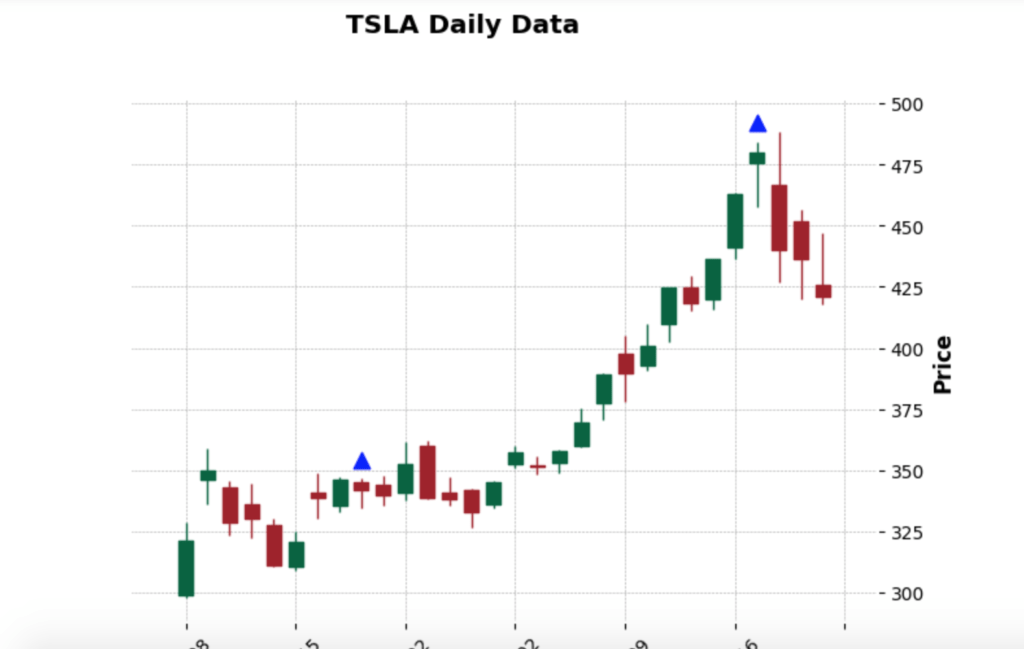
And…when I run the above functions, it produces the following outputs:
Sweet, isn’t it? Now, if you want, you can use this data to generate signals or alerts to inform you about trend reversals
Conclusion
In this post, you learned how to identify trend reversals with the help of hammer patterns and how to automate this process in Python. In the next post, I will discuss another pattern, but this time with the help of a library that has already done all the work for you. As always, the code is available on GitHub
Looking to create something similar or even more exciting? Schedule a meeting or email me at kadnan @ gmail.com.
Love What You’re Learning Here?
If my posts have sparked ideas or saved you time, consider supporting my journey of learning and sharing. Even a small contribution helps me keep this blog alive and thriving.
