
Developing a website is not enough these days. Even developing an “awesome looking” website is not only going to serve your purpose unless it loads faster and rank better on Google.
In an earlier post I discussed how you can use free SEO Tools to rank better on Google but Google’s core search algorithm has been evolving continuously and now they are also taking site speed into consideration. For that purpose they are relying on their own tool called Page Speed which helps you to figure out what Google thinks about your website.
The goal
The goal is: how a developer, a front-end developer/designer or.. even a backend developer like me can use free tools to optimize an existing website and make a prototype of it without any approval from THE BOSS and without requesting any external help.
I am only covering basic concepts rather than discussing UI/UX philosophy which is not purpose of this post. UI/UX.
Topics being covered
I am going to cover following:
- How to use free development tools to create your workflow for minimizing CSS and Javascript files.
- How to use free online tools to minify HTML, optimizing images.
- How to use Google PageSpeed and WebpageTest to test our efforts.
Site Selection

The site I selected for study was none other than Pakistan Govt’s Official Portal. Following are the reasons this site was best suited for my study:
- It is using old web standards. No HTML5 and CSS3
- Not Mobile friendly
- Improper HTML structure
- Multiple CSS and JS files
- Uncompress Images
- Not a WordPress website (Optimizing a WP site is like opening a can of worms)
Usually Government websites sucks all over the world, for example, check the PageSpeed score of USA government website.
Mobile Friendly and PageSpeed Test
We are entering in 2017. Mobile users have already surpassed Desktop users. It’s quite obvious that you’d like to know whether your website is mobile friendly or not. Google provides a free tool called Mobile Friendly Test, use this to learn how your site renders on mobile devices. I gave Pakistan Government Portal a try and:
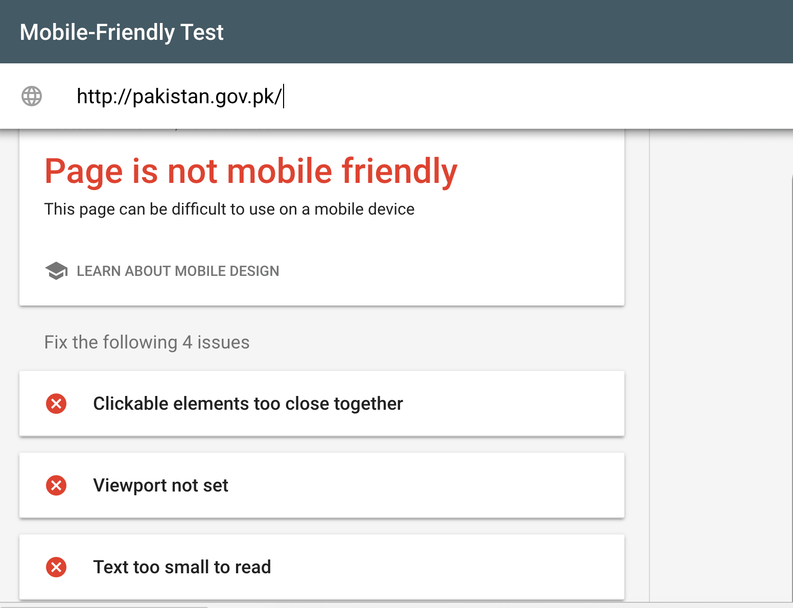
Ouch! that hurts. Beside showing a Big red about non-Mobile-friendly website, it also gives hint reasons of it. One of them is that viewport is not set. Let’s look into it first. Since I already downloaded required page and assets from the main website, I’d be making changes locally.
<meta name="viewport" content="width=device-width, initial-scale=1, maximum-scale=1, user-scalable=0">
The line above going to resolve viewport. Setting viewport lets the entire page gets adjusted as per the device currently rending it. I am also going to make the site compatible with different IE versions prior to IE11 to render pages in Edge mode.
<meta http-equiv="X-UA-Compatible" content="IE=edge">
Ok so far so good. Let’s take a look what does PageSpeed says about the website. Well, not something good.

Only 53/100. More than bad.
If you read,Google is already suggesting the issues with your website and also providing ways to do it. It does not stop here, it fetches assets from your page like CSS/JS and Image files and minify and compress them and provide you to just use it but I’m not going to take this route and I’ll take care of it locally on machine.
Ok we can see what the issues are: Minifying JS and CSS files, make them merge to a single file and setting a proper font-size.
Gulp and Twitter Bootstrap
In order to make page mobile friendly, I am going to use Twitter Bootstrap framework that has already taken care lots of burden of developing mobile friendly pages. Though version 4 of TBS is available but like many I am still sticking with version 3. I’ll recommend same to you. The other tool I am going to introduce is Gulp. GulpJS helps you to automate your workflow and make you focus on your original work: development. Instead of wasting time minifying CSS/JS files, copying from one folder to other folder, all you can to setup gulp task file and let it do the stuff on your behalf. Gulp is a node module so you should have NodeJS installed locally on your machine. Setting up Gulp is not the part of this post and you may find some awesome tutorials online.
OK, so below is my gulp.js file:
var gulp = require('gulp')
var concat = require('gulp-concat')
var minifyCSS = require('gulp-minify-css')
var uglify = require('gulp-uglify')

gulp.task('default', function () {
  gulp.src('resources/css/*.css')
    .pipe(minifyCSS())
    .pipe(concat('style.min.css'))
    .pipe(gulp.dest('public/css'))
})

gulp.task('minify', function () {
  gulp.src([
    'resources/js/jquery-1.4.min.js',
    'resources/js/jquery.imagerotator.1.0.min.js',
    'resources/js/bootstrap.min.js',
    'resources/js/site.js'
  ])
    .pipe(concat('scripts.min.js'))
    .pipe(gulp.dest('public/js'))
})
After installing required node modules:: gulp, gulp-concat, minify and uglify, I am going to write my workflow that is, how tasks should act upon my JS and CSS files. I already copied required CSS and JS files from the website and put them in separate resources folder. Remember, your task is not to ruin existing site and codebase but to make a better one in parallel. I am putting assets in resources folder, gulp then copy it after a series of tasks into public folder which is then being referenced in HTML document.
The should be a default task and you may add other tasks. In default I am fetching ALL CSS files from resources/css and then minifying it and then merging ALL of them into a single CSS and copying into public/css folder. Now all this can be done manually as well like developers had been doing it earlier. Here, you don’t need to worry about all this. From terminal run gulp or gulp <taskname> command and it should execute related task. So for default I am running gulp which minify CSS and for JS I run gulp minify which minify JS files.
I am also creating a new index file, called index2.html and here I will write my mobile friendly HTML aided by Twitter Bootstrap.
CSS Gradients
If you visit the Pakistan government website, you’ll notice a green and white gradient background. It uses a 16 × 900 PNG image that is around 5.5 KB in size. With CSS3, you can achieve the same result without using an image file.
My goal is to speed up the website by eliminating as many HTTP requests as possible and optimizing the remaining ones. Now, the issue is: how do I generate the CSS when I’m neither a CSS ninja nor a designer? I also don’t want to bother other people with my experiments.
I always try to find generators for different kinds of tasks during development. Luckily, someone created a tool that converts a gradient image into CSS gradient rules. You can also use tools like this mesh gradient generator.
To make the gradient appear across the site, I did the following:
html {
  height: 100%;
}

body {
  height: 100%;
  font-size: 12px !important;
  font-family: Arial, Helvetica, sans-serif;

  background: -webkit-linear-gradient(
    top,
    rgb(18, 89, 44) 0%,
    rgb(158, 188, 169) 18%,
    rgb(252, 253, 252) 32%,
    rgb(252, 253, 252) 100%
  );

  background: -o-linear-gradient(
    top,
    rgb(18, 89, 44) 0%,
    rgb(158, 188, 169) 18%,
    rgb(252, 253, 252) 32%,
    rgb(252, 253, 252) 100%
  );

  background: -ms-linear-gradient(
    top,
    rgb(18, 89, 44) 0%,
    rgb(158, 188, 169) 18%,
    rgb(252, 253, 252) 32%,
    rgb(252, 253, 252) 100%
  );

  background: -moz-linear-gradient(
    top,
    rgb(18, 89, 44) 0%,
    rgb(158, 188, 169) 18%,
    rgb(252, 253, 252) 32%,
    rgb(252, 253, 252) 100%
  );

  background: linear-gradient(
    to bottom,
    rgb(18, 89, 44) 0%,
    rgb(158, 188, 169) 18%,
    rgb(252, 253, 252) 32%,
    rgb(252, 253, 252) 100%
  );
}
here I am setting html height to 100%; otherwise, the HTML will not fill the HTMLar. Unlike image which occupies a region expand height, you gotta need to set height to 100% or whatever the % are you looking for.
Responsive Image Rotator
The site is also using some jQuery plugin to rotate images on top. No issue with that but the issue is the code was put on top of the body which eventually becoming reason to load site slow since Javascript and CSS are blocking resources. Check below:
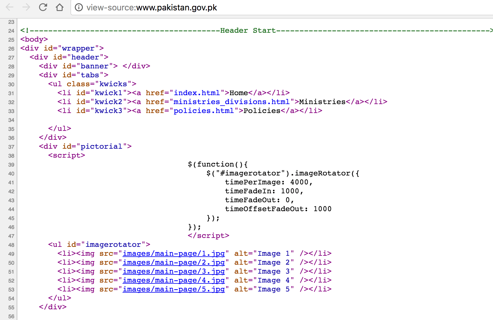
I have created a new JS file, named site.js and put that code in it. Also I optimized rotating images to reduce their sizes. Don’t go to any graphic designer or using Adobe Photoshop for the purpose, use free OptimZilla for the purpose.
Beside using Online tools, you should also install Browser Plugin to give you idea how your site renders on different screen size. I use Responsive Web Design Tester Chrome plugin for the purpose. Here’s the screenshot of it:

As you can see, Google is not whining without a reason.
After making a few changes, I made an attempt to test it on Google Speed and this is what I got:
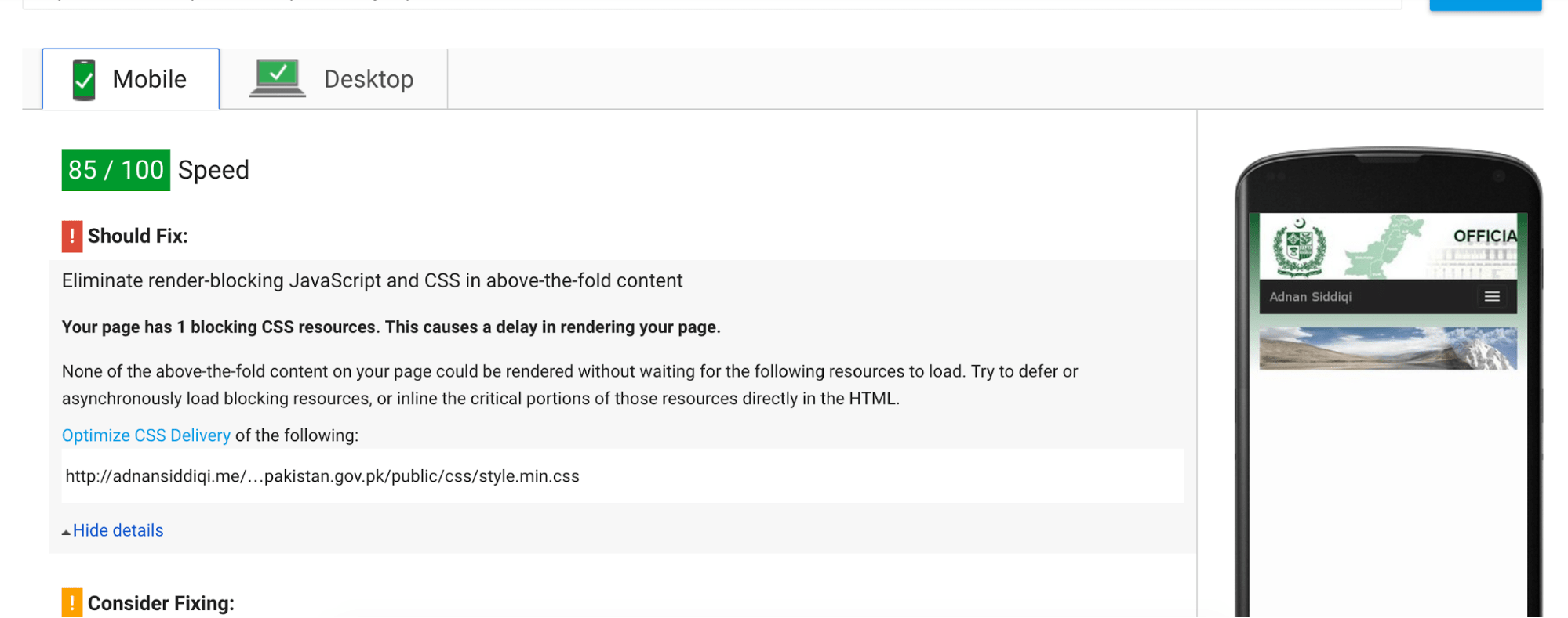
85/100. Not bad, but it’d change as we moved further. Since I don’t have access to Govt website, I am putting all changes up on my own server.
I restructured the HTML of the entire page and added a bit of content just for proof of concept. Once when you’re all done with your HTML changes, it’s good as it’s also recommended by Google to minify HTML. I used this tool for the purpose.
Enable compression via .htaccess
By writing this code in .htaccess file you can compress different types of files on your server to speed up further. Make sure .htaccess exist in root folder of your site
```apache
AddOutputFilterByType DEFLATE text/plain
AddOutputFilterByType DEFLATE text/html
AddOutputFilterByType DEFLATE text/xml
AddOutputFilterByType DEFLATE text/css
AddOutputFilterByType DEFLATE application/xml
AddOutputFilterByType DEFLATE application/xhtml+xml
AddOutputFilterByType DEFLATE application/rss+xml
AddOutputFilterByType DEFLATE application/javascript
AddOutputFilterByType DEFLATE application/x-javascript

<IfModule mod_gzip.c>
    mod_gzip_on Yes
    mod_gzip_dechunk Yes
    mod_gzip_item_include file .(html?|txt|css|js|php|pl)$
    mod_gzip_item_include handler ^cgi-script$
    mod_gzip_item_include mime ^text/.*
    mod_gzip_item_include mime ^application/x-javascript.*
    mod_gzip_item_exclude mime ^image/.*
    mod_gzip_item_exclude rspheader ^Content-Encoding:.*gzip.*
</IfModule>
```
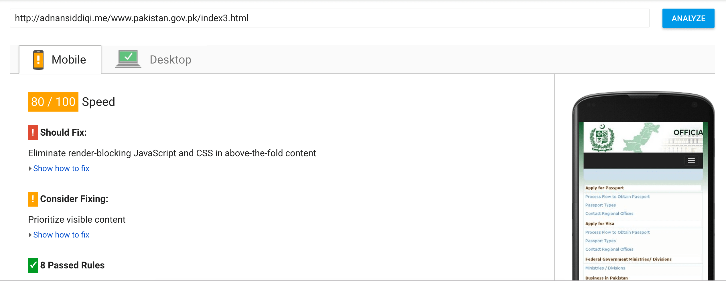
Result
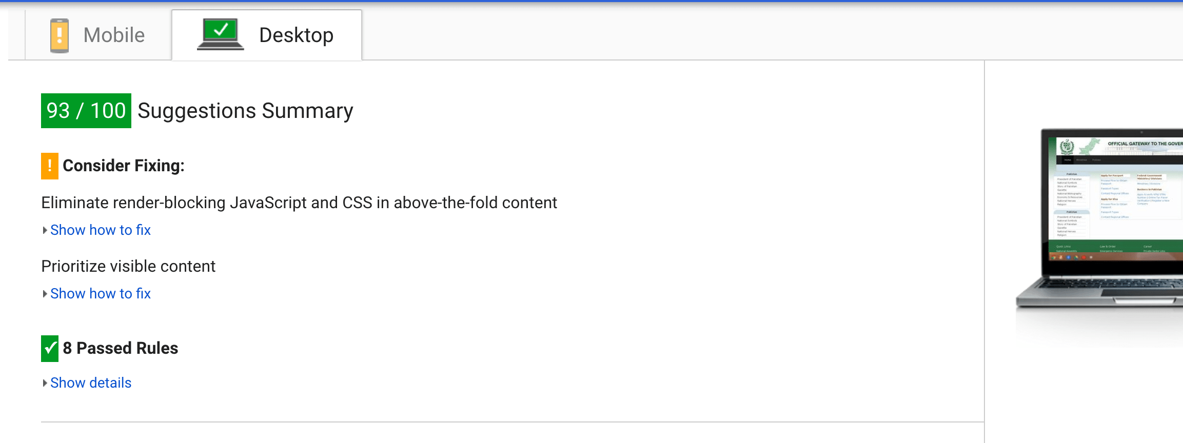
Below is the PageSpeed score of both Mobile and Desktop
Testing Performance
Google PageSpeed gives you an idea of how well your website performs, but it isn’t everything, and you shouldn’t push yourself too hard to achieve a 100/100 score. I could have resolved a few more issues and achieved a score of 95+, but the site’s existing CSS structure made that difficult, and achieving that score wasn’t the goal.
Now I want to check how far my changes have made an impact. In order to see how good my site is loading, WebpageTest is the best tool available. On checking Official Website:

Too much red. Now you can start getting idea what thing is going wrong. A big F on receiving first byte. Look another screenshot of same page:
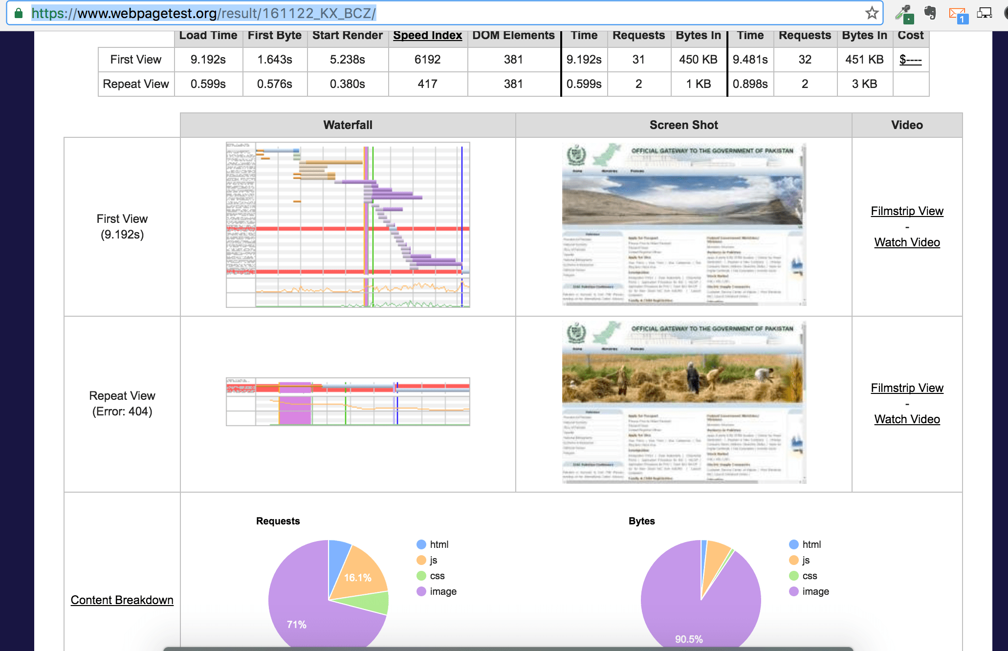
Around 10 seconds for the first time load. 10 seconds is too much in Internet world. The most recommended load time is 2seconds at max. The report link here gives you idea what thing is taking much time. Now detail view gives you more idea:
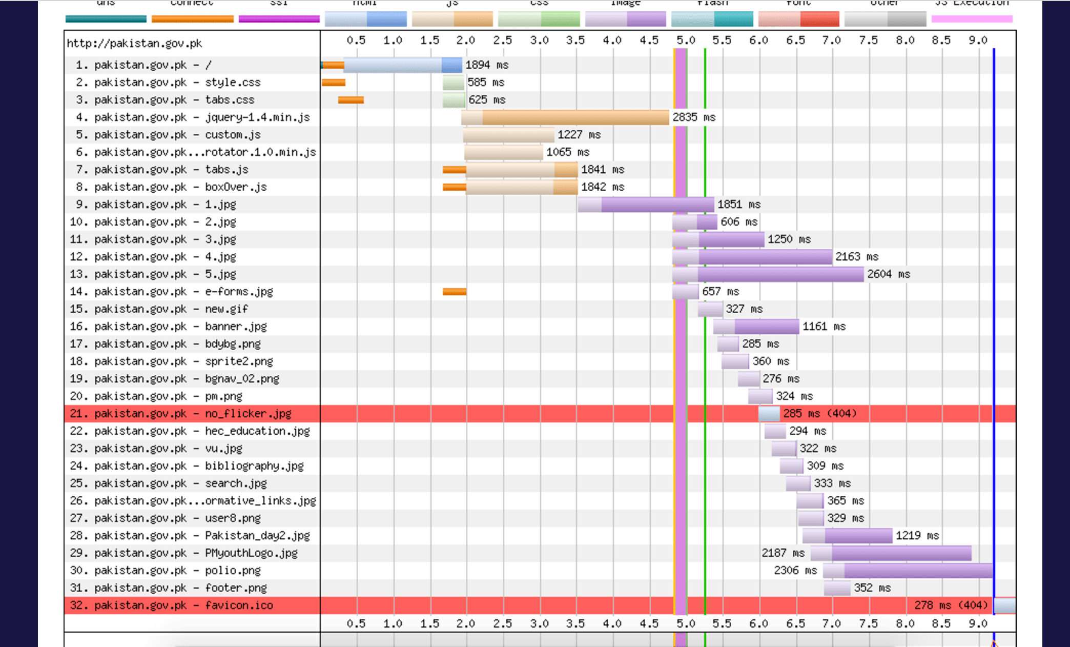
If you look at the image above, or better yet, the live report, you can see that render-blocking JavaScript and CSS load immediately after the HTML document. The document itself took a long time to load, which makes sense because it’s larger than my version. The blocking JavaScript, followed by the image, delayed rendering and slowed down the page.
Now compare it with mine one:
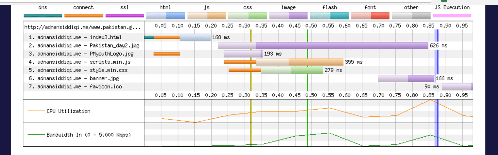
It took around 0.875 seconds to load, as you can see in the detailed view. After the HTML document, the page loads the rotator files.
In the original waterfall view, Pakistan_day2.jpg and PmYouthLogo.jpg took 1,219 ms and 2,187 ms to load, respectively. After optimization, the detailed view shows that these images took 626 ms and 193 ms, respectively. That’s a huge difference from optimizing the images alone.
Conclusion
That’s it! I’ve shown you how, as a developer or designer, you can optimize an existing page and bring it in line with modern web standards.
There are many other reasons a website might be slow, particularly those related to backend infrastructure, such as slow MySQL queries, redundant database connections, and a lack of CDN usage or caching. These deserve a separate discussion, and I’ll cover backend optimization someday. Until then, enjoy this!
You can view the final optimized page here. I also made a few visual changes to the footer and navigation bar because I didn’t like those on the original page. You can view the uncompressed HTML page here and download the code from GitHub.
Is your website loading slow, and you want to know what’s going on? I can help you in this regard. Just send me an email at kadnan (at) gmail (dot) com and I’ll try to help you out.