
I recently covered data gathering via scraping. Now I am going to cover how the data can be visualized. The best way to do is to plot graphs. Graphs makes it easier to see the relation between a data variable with other. There are various kinds of graphs available: Line, Bar, Chart, Histogram etc.
Since we are dealing in Python, it provides a very good library for plotting cool graphs. It’s called Matplotlib.
From the Official Site:
Matplotlib is a Python 2D plotting library which produces publication quality figures in a variety of hardcopy formats and interactive environments across platforms.
Installation
The best way to install it by using pip command:
pip install matplotlib
pip will take care of dependences itself so you don’t need to get worried about it.
Line Graph
So what is line graph? According to Wikipedia
A line chart or line graph is a type of chart which displays information as a series of data points called ‘markers’ connected by straight line segments.
Line graphs are usually used to find relationship between two data sets on different axis; for instance X, Y.
OK enough talk and now make our first graph program.
Create a new file, I call it line.py and import matplotlib library in it.
import matplotlib.pyplot as plt
The alias plt has been set for simplification purpose.
Next, we need our data points. Let’s take simple one:
x = [2, 4, 6]
y = [1, 3, 5]
plt.plot(x, y)
plt.show()
plot() takes various variables, for now I am passing x and y only for plotting purpose. The show method displays it in a window like below:

As you can see, even numbers are are X-axis where odd on Y-axis.
You can also see a few buttons to manipulate the view of the chart, like Zoom button, moving forward and backward.
OK, it was very simple and to be honest a very useless graph. Let’s use some real dataset and plot the graph.
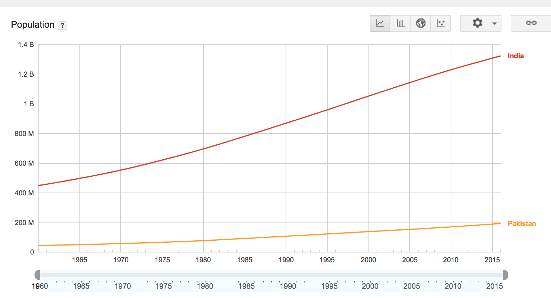
For sake of example I am using population dataset of India and Pakistan. I am using Google Public Data as a data source.
year = [1960, 1970, 1980, 1990, 2000, 2010]
pop_pakistan = [44.91, 58.09, 78.07, 107.7, 138.5, 170.6]
pop_india = [449.48, 553.57, 696.783, 870.133, 1000.
4, 1309.1]

plt.plot(year, pop_pakistan, color='g')
plt.plot(year, pop_india, color='orange')
plt.xlabel('Countries')
plt.ylabel('Population in million')
plt.title('Pakistan India Population till 2010')
plt.show()
From the above source I got the data of both X and Y axis. year will be on x-axis where population of both countries. Since I need two different lines so plot was called twice. The color attribute used to assign the color of the line.
xlabel and ylabel are being used to give some friendly name to the axises and finally .title() for giving the name of the entire graph. When runs it will appear like given below:
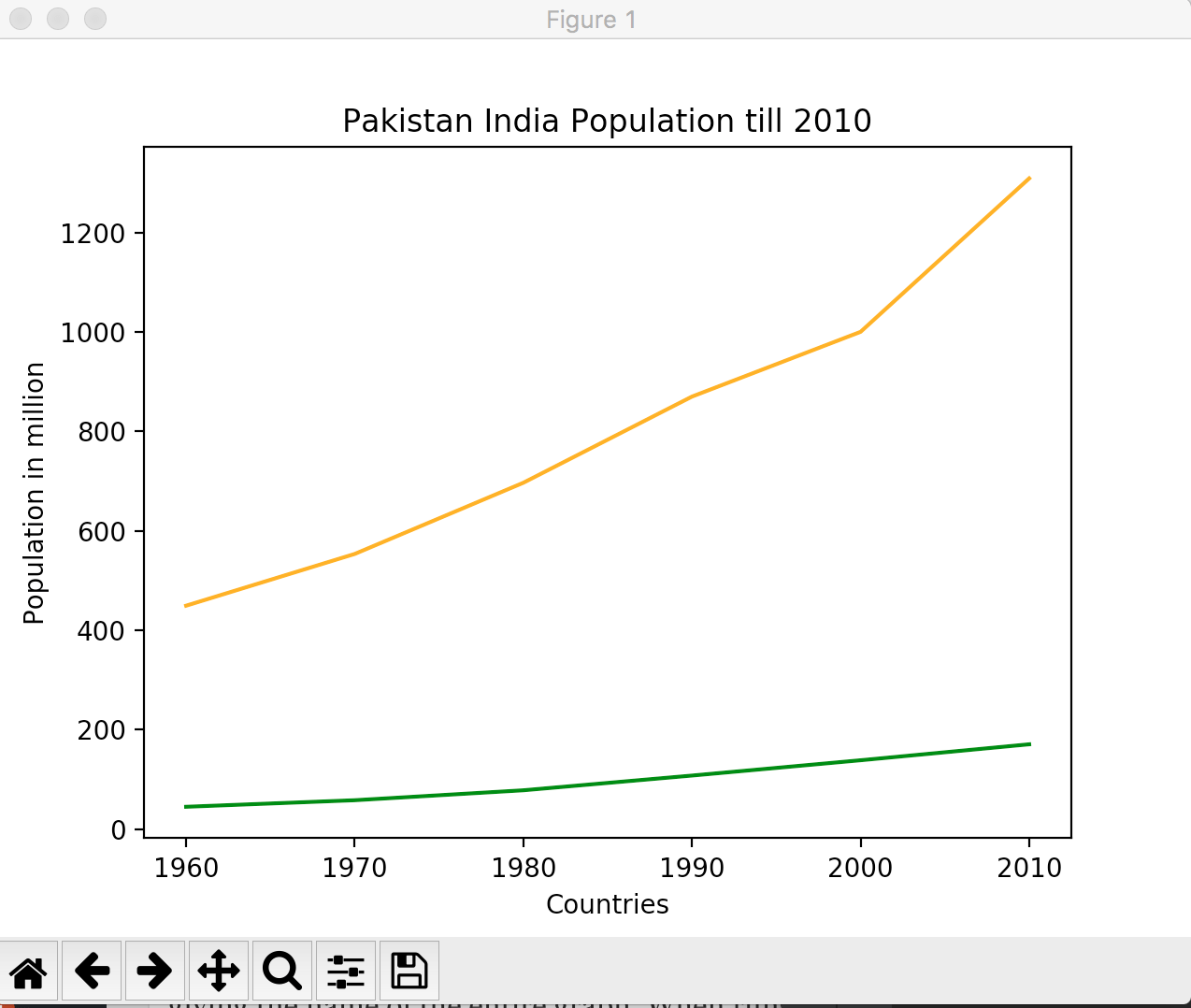
Looks cool, right? Pretty much similar to what you see on Google Public data interface, a bit of variance is because I rounded off the population for the sake of simplicity.
That’s it for now. In coming post I will be discussing some other graph. Just hang in there.