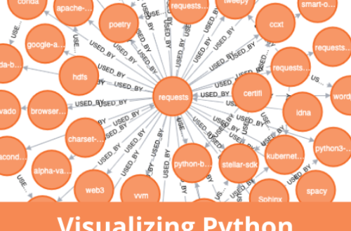
Almost one and half year back I create a data visualization series with Matplotlib which was appreciated by hundreds of developers. Today I am going to start another data visualization series to create interactive graphs and charts in Bokeh.
What is Bokeh
From the official website:
Bokeh is an interactive visualization library that targets modern web browsers for presentation. Its goal is to provide elegant, concise construction of versatile graphics, and to extend this capability with high-performance interactivity over very large or streaming datasets. Bokeh can help anyone who would like to quickly and easily create interactive plots, dashboards, and data applications.
In short, Bokeh allows Python developers to create interactive charts that are rendered as HTML and Javascript.
Why Bokeh?
You might be wondering why do you need Bokeh when Matplotlib is already around and doing well? As I mentioned above, Bokeh gives you the opportunity to create interactive graphs that could provide more information than static graphs which are generated in Matplotlib. On top of it, you can use the generated graph output in an HTML document which is rendered on standard browsers, thus it gives options to non- developers to use the graph to professionals like journalists to describe their stories. Interactive graphs got popular after D3.js library but the learning curve is steep hence many developers are not able to use it easily.
Development Setup
Installation of Bokeh library is easy. The best way to install it by using pip command:
pip install bokeh
pip will take care of dependencies itself so you don’t need to get worried about it.
Now we are going to work on our first program that will generate a line graph.
from bokeh.plotting import figure, output_file, show

if __name__ == '__main__':
    output_file('line.html', mode='inline')
    plot = figure(title='Sample Graph',x_axis_label = 'X Axis',y_axis_label = 'Y Axis')
    plot.line([1, 3, 5, 7, 9], [0, 2, 4, 6, 8], line_width=2)
    show(plot)
After importing the necessities I called output_file() method which takes a file name as a parameter. What actually it does that it dump the graph output in the given HTML file. The figure() method lays the ground for your creativity. I just took a few even and odd data points here. The show() method takes plot object as a parameter and shows the file in the browser. We also set title and labels for both X and Y axis. When you simply call output_file() with file name only, it loads both CSS and JS from a remote CDN. If you open line.html you will see something like this:
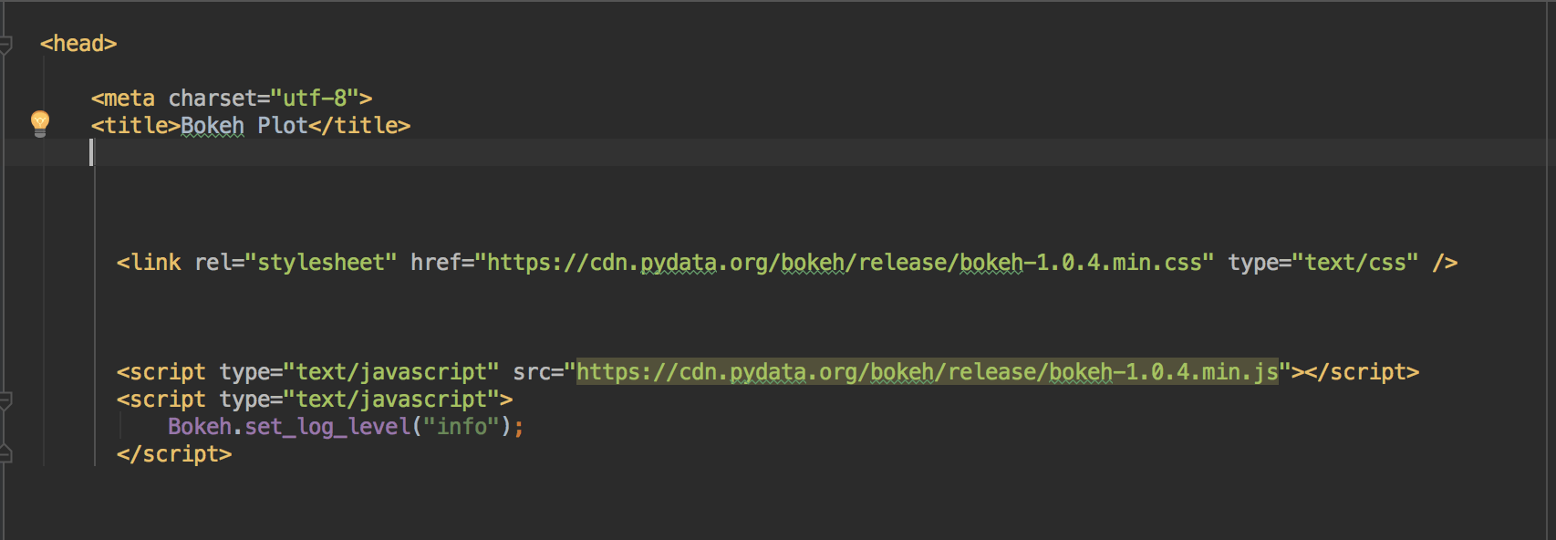
It takes time to load, in order to load both CSS and JS locally you will add mode=inline parameter in output_file(). Once you do, all the JS and CSS then loaded inline hence loads easily.
Let’s work on real data. In the matplotlib related post for a line graph, I used the population data of India and Pakistan. I will be using the same data again.
from bokeh.plotting import figure, output_file, show,save

if __name__ == '__main__':
    year = [1960, 1970, 1980, 1990, 2000, 2010]
    pop_pakistan = [44.91, 58.09, 78.07, 107.7, 138.5, 170.6]
    pop_india = [449.48, 553.57, 696.783, 870.133, 1000.4, 1309.1]

    output_file('line.html', mode='inline')
    plot = figure(title='Population Graph of India and Pakistan', x_axis_label='Year',
                  y_axis_label='Population in million')
    plot.line(year, pop_pakistan, line_width=2, line_color='green', legend='Pakistan')
    plot.line(year, pop_india, line_width=2, line_color='orange', legend='India')
    show(plot)
I took data from the previous graph related post. After setting of the file name, title, etc, I called plot.line twice as we have two countries’ data. I also set the legend and color thees etc. Once run it will open an HTML file in the browser.
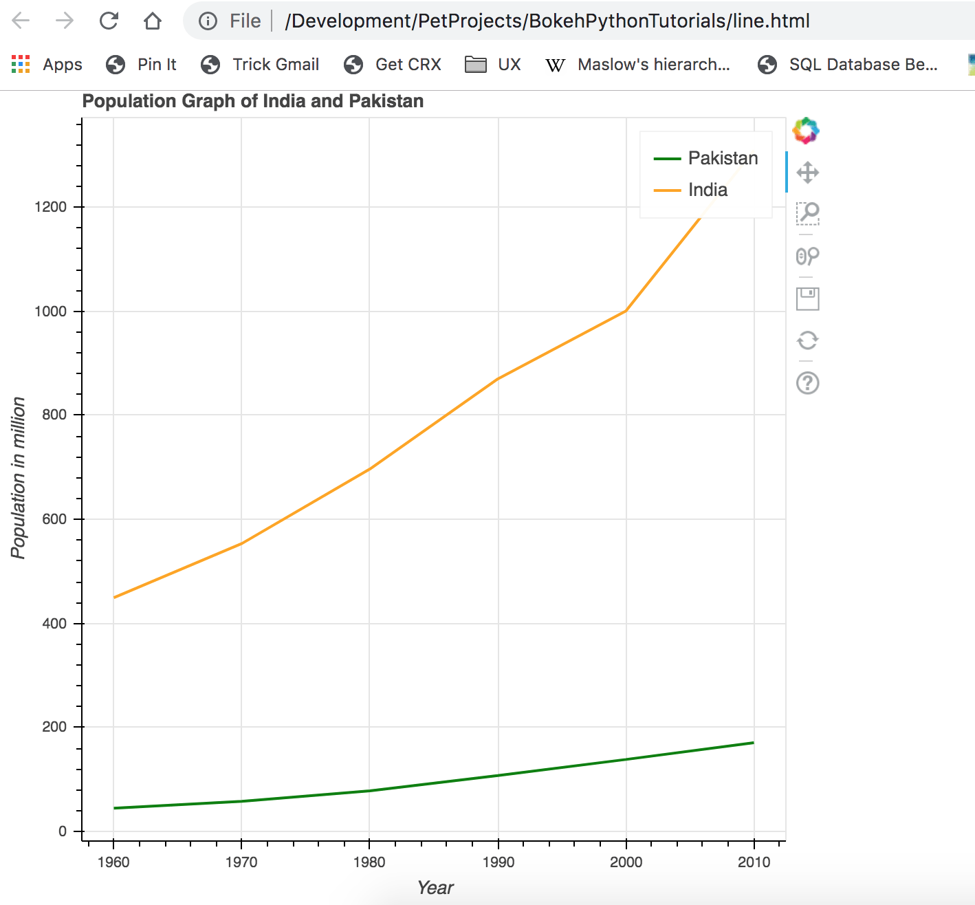
Looks good, pretty much similar to what I did with Matplotlib. Can you notice the tools on the top right, they can help to zoom in/out, saving the graph in image format and a few others. Let’s add points now in graph so that we can know actual data points.
plot.line(year, pop_pakistan, line_width=2, line_color='green', legend='Pakistan')
plot.circle(year, pop_pakistan, fill_color="green",line_color='green', size=8)
plot.line(year, pop_india, line_width=2, line_color='orange', legend='India')
plot.circle(year, pop_india, fill_color="orange", line_color='orange', size=8)
show(plot)
Once run you can see the circles indicating the data points.
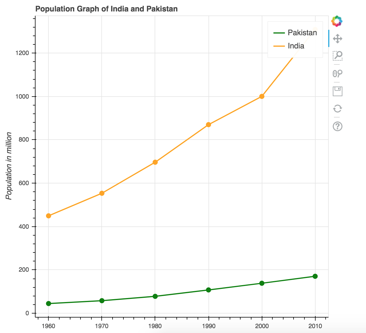
Looks much better. How about make it interactive by showing information on hover? Before we do that, let’s discuss a bit about ColumnDataSource.
ColumnDataSource(CDS) is a data structure Bokeh uses to render graphs. You can use python dictionaries and list too for assigning data but you are not able to use features like showing information on Hover is not available.
source_pk = ColumnDataSource(data=dict(
        year=year,
        population=pop_pakistan,
    ))

source_in = ColumnDataSource(data=dict(
        year=year,
        population=pop_india,
    ))
I created two CDS objects and assigned value to keys. We will then use it in plot object.
plot.line('year', 'population', line_width=2, line_color='green', legend='Pakistan', source=source_pk)
plot.circle('year', 'population', fill_color="green", line_color='green', size=8, source=source_pk)

plot.line('year', 'population', line_width=2, line_color='orange', legend='India', source=source_in)
plot.circle('year', 'population', fill_color="orange", line_color='orange', size=8, source=source_in)
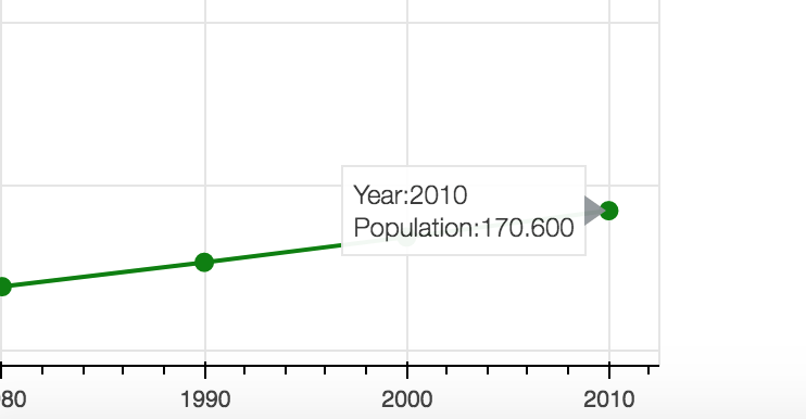
I passed two different CDS for different countries. The result would be the same as above. Now I want to show information whenever someone hovers the mouse on data points. For that, we will use HoverTool object.
hover = HoverTool()
hover.tooltips = """
<div style=padding=5px>Year:@year</div>
<div style=padding=5px>Population:@population</div>
"""
plot.add_tools(hover)
Do you notice @ with string? This is used to access the key/value store in CDS. I then made Hovertool the part of plot object by calling add_tools method. When you run it now, it shows the following information on hover.
Conclusion
In this post, you learned how to install Bokeh and how you can easily create interactive graphs in it by writing a few lines of code. In coming posts I will be discussing other kind of graphs that you can create in Bokeh. The code is available on Github.